Life Insurance Quote Comparison Tool
Product Design ● UI Design
overview
Techficient, an InsurTech startup, is revolutionizing the speed and accuracy of the quotes agents present to clients, with their product, Dynamic.
Dynamic equips agents to create custom life insurance quotes catered to their client's lifestyle and needs – instantly. However, the product needed a design overhaul before being pushed to Techficient’s clients.
Dynamic is part of another Techficient product, Portal.
my role
As principal designer I was responsible for:
Research
Sketches
Wireframes
Prototypes
Style guide

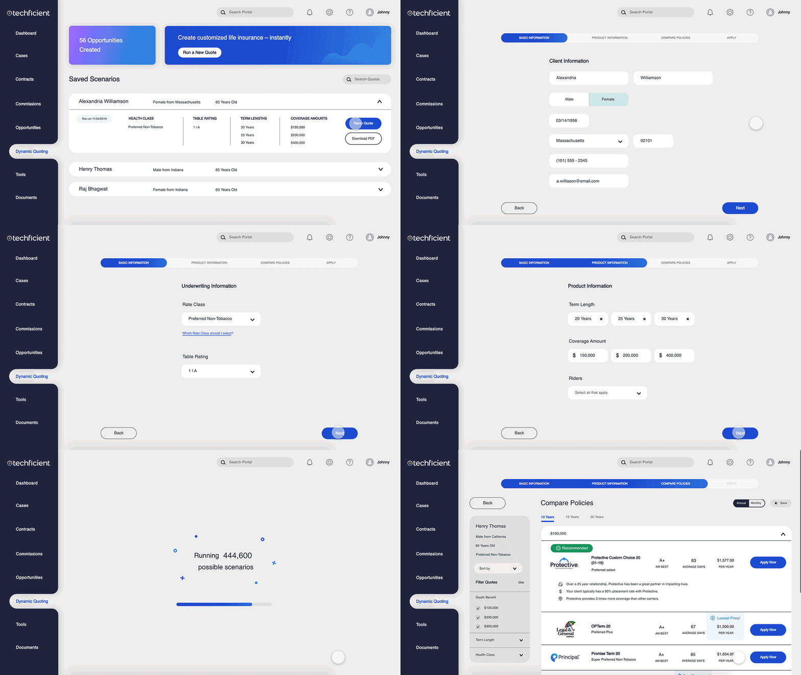
MVP sequence in action
goals
process
understanding the user
user persona
competitive analysis
Dynamic has just one direct competitor in the B2B life insurance space, where the agent would be running the quote.
I explored various types of B2C insurance comparison tools to gain insight into current trends and form flows.
mapping users
Dynamic is accessed through another Techficient product, Portal.
Understand what expectations agents have when entering Portal to run a quote in Dynamic.
Agents can easily jump back into other parts of their business, as their focus can change with one phone call.
what’s useful for the user?
Through analytics, I distinguished what was most useful for agents:
design
DYNAMIC DASHBOARD
Where agents start or resume their journey.
Additionally, their dashboard is a log of previous scenarios, keeps track of their progress, and allows agents to revisit past quotes.
SKETCH
Here I explored what the menu would look like and work without the full Portal capabilities displayed.
WIREFRAME
Full Menu was implemented.
Also included a secondary tab for quotes that were applied.
FORM PAGES
Agents get customized quotes in three easy steps.
Each step is designed to capture pertinent data that powers the algorithm.
Step One: Client Information
Step Two: Underwriting Information
Step Three: Product Information
SKETCHES
Many data points posed a challenge to streamline and process and eliminate monotony.
WIREFRAMES
I started to experiment with adjusting fields to reflect their information, not just follow the style.
RESULTS PAGE
Instantly understand what’s best for clients.
Based on the powerful algorithm, the top five best options flow to the top.
Recommended, Lowest Price, and Fasted Placement are pointed out to help agents.
iteration one
SKETCH
I wanted to explore cards as a way to isolate information.
WIREFRAME
Cards worked well to communicate the information. However, they did not allow for the top five products to be visible.
iteration two
SKETCH
Back to the drawing board to allow agents to see the top products.
WIREFRAME
Filter and term-length tabs added to fit screen.
results icons
The recommendation is the core of the business strategy and needed to be obvious to agents.
Using color, imagery, and human nature, I created banners to accompany the most valuable choices for clients.
APPLY PAGE
Imperative last step for task completion and revenue generation.
Dynamic saves the agent’s quote to their dashboard and to their integrated CRM.
SKETCHES
Several iterations to determine which layouts flowed to final submission and also served as final confirmation of client info.
WIREFRAME
By fitting all the information in the window view height, it allows agents to easily scan everything all at once and feel confident before hitting submit.
mvp
We reached MVP with plans for Techficient to run user testing.
*Future versions and features of Dynamic will be dependent on the funding partner.
takeaways
It was exciting to be part of this project and lead the design. I learned that I’m passionate about forms that work with the user – straightforward, communicative, and beautiful.
In hindsight, the team could have stuck to a more agile approach instead of defaulting to waterfall. We had a few sprints, but these were difficult to stick to as the scope shifted and other goals were raised.


